To be absolutely honest, graphic designer was never my first choice. As far back as I can remember I was motivated to be a drawer, that’s because of a christmas card I drew and the admiration given by my kindergarten teacher. When I get older I start to dress up myself, “I should become a fashion designer someday.” I tell myself. I spend a lot of time reading magazines, and I always prefer Japanese magazines, as time went by I start realise why I always love the Japanese magazines specially the ‘Fudge’ and ‘Popeye’. I believed it is because of the methods like how the images and were constructed, the cropping and how can the text and everything flowing so freely across pages by pages and the way they drawn reader’s attention to the way they plan to. And these is how I end up being a Year 1 graphic design student. Is graphic design only could be seen in magazines? Big No! Graphic design is the most ubiquitous of all the art forms since it can found everywhere and anywhere—in our homes, in the restaurants we frequent, on the streets we walk, on the highways we drive, in the movies and theatres we attend, and in every shop we enter.(Rescind, 2003)
Even though the definition of graphic design at the past were always linked to promotion of goods and services, but the world is progressing so as graphic design. Graphic design had moving onto something bigger. In the book “Design for Communication”, it mention that, “A more contemporary definition of graphic design might included “Art” of communication, to inform, educate, influence persuade, and provide a visual experience— once that combines art and technology to communicate messages vital to our daily lives. It is simply a cultural force.”(Resnick,p.15, line 23-27) It show the importance of graphic design and the value of it and we become breathe and live in it. Although typography always the first thing to jump in you mind, there are still a branch of learning in the graphic design world, for example magazine design, advertising, book design, corporate identity, film titles, tv graphics, new media, environmental design, web design, design education, type design, motion graphics, information graphics, package design, etc. As a graphic design freshman, I have been given instruction of the basics such as the introduction of different design programmes, zine layout, typography from school to build a well rounded professional portfolio. If you ask me what is my role as a graphic designer, I do not think I will be able to give you a proper answer for that or a target that I would definitely going to achieve in the future.
Short of saying as a freshman there are still specialities that I have not get my hand on yet, I still want to keep my option open at the moment, which I totally agree what Steven Heller said in the book ‘Becoming a Graphic Designer’, ”Although it is not necessary to be expert in everything, it is useful to be fluent in as many forms as possible, at least while you are looking for a possible career niche.”(Heller,p.22, line3-4) Of course I could go on forever if I have to cover all the details of each specialisations, so I will only talk about a few particular one that I am curious in.
As I said magazine is what lead me to graphic design, and not to mention magazine and newspaper s are also offer opportunities to a large amount of junior and senior designers and art directors. In the magazine infrastructure; design duties were normally divided into two fundamental groups: editorial and promotion. A design director or art direction is the managerial level in the hierarchy who take charges of managing the overall design department and design of the magazine including the format, this mean include overseeing the work of senior and junior page designers and designing pages and cover, and it also involve assigning illustration, photography and typography. Apart from that, an art director likewise to have meetings with editors and sometimes authors just to discuss how they want to present the article. Some of these duties are delegated to an associate art director. On the next lower level there are senior and junior designer in the support level, who are responsible for designing either features, columns, inserts,etc. and the different between senior and junior is usually the degree of experience and talent. Soon afterward there are intern which is temporary also a stepping stone, but sometime its quite contradict because of the lower salary even unpaid internship. The most common task are support work like production, such as scanning images into computers or maintaining files, or a minimal amount of layout or design work if you are lucky enough, basically all the odd jobs that need to be done. Of course the employer can always noticed excellence of a worker, even the odd job could result in significant acceleration(Heller & Fernandes,1999, p.24-27).
Move away from magazine, I will now talk about corporate design—CI. Corporate design is not only produced emblematic corporate identities but also modernised the very practice of corporate identity by designing individual components of the corporate communications for examples: catalogs, brochures, posters, instruction guides. Once the logo is decided, then you will start to begin the other elements of CI proceeds. That is mean the standard manual, which follow by setting up a rigorous rules of maintenance such as how, when and where the logo will be used and what additional typefaces will represent the company. Then the manual further presents the grid and the structure of any coordinated system. And grid are used in daily item such as stationery, business cards, mailing labels, hang tags, instruction manuals, etc. The manual also shows the permitted type sizes, weights and colours. One proper CI system is usually contracted to an external design film working in conjunction with the internal design department of a particular company. The in-house designers will be in charge of the corporate materials—from business cards to annual reports, from newsletters to packages. And the external design firms will commissioned to produce special components of the corporate communications program like advertising, promotion, annual report,etc. Companies will expect their annual report to be an elaborate piece of design that could follow the CI system guideline but stand out among the standard communications of the company at the same time, and of course they will farmed out to design firms that specialise in conceptual thinking, visual creativity and high-end printing(Heller, 1999; Fernandes,1999, p.50-52).
Meanwhile, I want to talk about a graphic designer also a product designer that I admire a lot—Kenya Hara, a Japanese graphic design. My first contact of Kenya Hara is his advertisement and art direction for Mujirushi Ryohin—a no brand quality goods. What makes Muji a valuable brand in Japan is because it never tend to become a global brand, the aim of mug is produce very basic designs but suit the lifestyle of the locals perfectly. As a country with all the history we have in the design industry, we are not interested in being part of the globalisation, being too simplistic and ubiquitous is what we must strive to avoid, he says. And He also suggest that we should treat all the thinking process as ‘awakening’ that could deepen our understanding of the objects in question, just like 6 thinking cap we do in class(Hara, 2014). He claims that, “The industry is now reaching its end, and we are going through a change, from having to create products to having to create value(Hara, 2014).” And Hara believes that designers need to consider how to think of culture as a resource, I agrees that Asian countries have a key cultural resource that cannot be found anywhere else in the world. What he mean is being original does not mean you should not learn about different cultures, because the more you understand the more you aware of your originality. But what you do not want is mixing up the similarities and differences, it will only end up with a mess. Rather than product design, Hara is also a design professor at Musashino Art University, the director of the Hara Design Institute, author of books “White”, “Designing Design” also a curator of large-scale design exhibitions(Kenya Hara:The Future Of Design, 2014). For me, I find his work very iconic, you can pretty much tell its by Kenya Hera by the decent minimal look. Although there are some opposite point of view of having their own character, just like Taku Sato another spotlight designer from Japan, He argues that having your own style of designing will make it difficult to get out of the shell(Sato, n.d.), and throwing them away will make you work more freely. I always thought having own kind of style is a good way to start, but at the time I am a bit self contradict because I could not disagree with what Sato said.
If I really have to pick one out of all the specialisations, I will probably go for magazine design. It is because for the very first project for in my GMD course, our task is to create a zine. And the integration of words and images interested me a lot. The difficult part is not decoration but coveys messages by manipulating type and images and solving conceptual problems by myself. I have ever done anything similar before, it is amazing that just letters of the alphabet could come up numerous way to form words and pass on meanings, so as visual element can be combines in innumerable ways. Often words carry more specific meanings than images, but images can extend and intensify the meaning of words. Just like Philip B. Meggs said, “When graphic designers bring words and image together to create visual-verbal messages, two problems must be resolved. First, visual organisation is a problem, for two totally unlike systems of communication—language signs and pictorial images—must be merged into a cohesive whole. The second problem involves message making: How can these two unlike communication systems come together to reinforce and extend one another(Meggs, n.d.)?” The emphasis of creating a decent layout is to find the balance between words and images, and the best way to enhance your skills is to practice and practice, that buzz me to work as a page designer that could ameliorate the typical style of Hong Kong’s fashion magazine, because I believe that transmit an idea successfully would definitely gain viewer’s attention, no matter how your fascinate your content is, people will always picked up magazine with better system or structure, that is simply because human being are mainly visual focus. For example in Hong Kong, mostly all the Japanese magazines were much more expensive than the locals one, and those Chinese edition were even more exaggerate, and in content as far as I can tell what inside were basically the same. Base on these three point, people will still prefer spending money on Japanese Magazine. Even though I love Japanese magazine but my aim to focus on magazine design is to change this phenomenon, I want to create a style of magazine that are not simply coping bit of others but increase the relevance of our own cultural and remind people to aware of our originality. Of course this was not easy, and I have so much to cram, and without a doubt three years is barely enough time to learn the tools,theory, history, and practice of graphic design, and internship are definitely an option to improve your additional skills outside your school time.


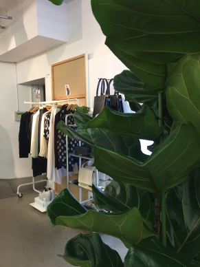 & Other Stories, a store with luxury design in TOPSHOP Boutique price. (but still unaffordable for me) But I went there a lot though, mostly because of the interior design are very lovely( specially with all the plant, so tumblr).


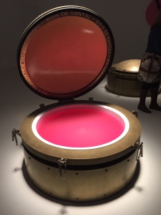 the Saatchi Gallery around 12ish, and the queue were like super long. It took me twenty something to get in( I don’t remember), you can smell the Chanel no.5 the moment you stepped in the exhibition. the first thing I’ve seen is a room with few metallic cube with pastel colour liquid spiralling in it which automatically open & close. I didn’t stay long cause I don’t understand at all. Then I moved on to a bigger room with plant all over the wall and they have like a maze on the ground, when I say plant they are real plants, so the room are a bit moist.I wanted to get a better picture but ppl are everywhere and they are too busy having selfies with the plants, Dah.


 After that, I went to the room with exhibit photography of celebrities wearing Chanel and the actual pieces and jewelries they worn in the photographs, and for security reasons you can not step really closely to the piece and the lighting are too dim( I think its because they do look better in the dark, photos or garment) I don’t even know what I’m looking at(feels like in the A&F with chanel no.5. Paul Smith and his wife are walking in front of me, just saying:)


 The week lecture is about the simulated space, I wasn’t that into it at first not until the slide showed up. It began with showing a couple of simulated space build by NASA, which is the Lunar Orbit and Landing Approach Simulator by NASA
 Memory and Line is the first lecture we had with Harriet, there are one quote that really stand out from the presentation, its saids “Points joined together continuously in a row constitute a line. So for us a line will be a